Quatre Mare
©2021
brand identity
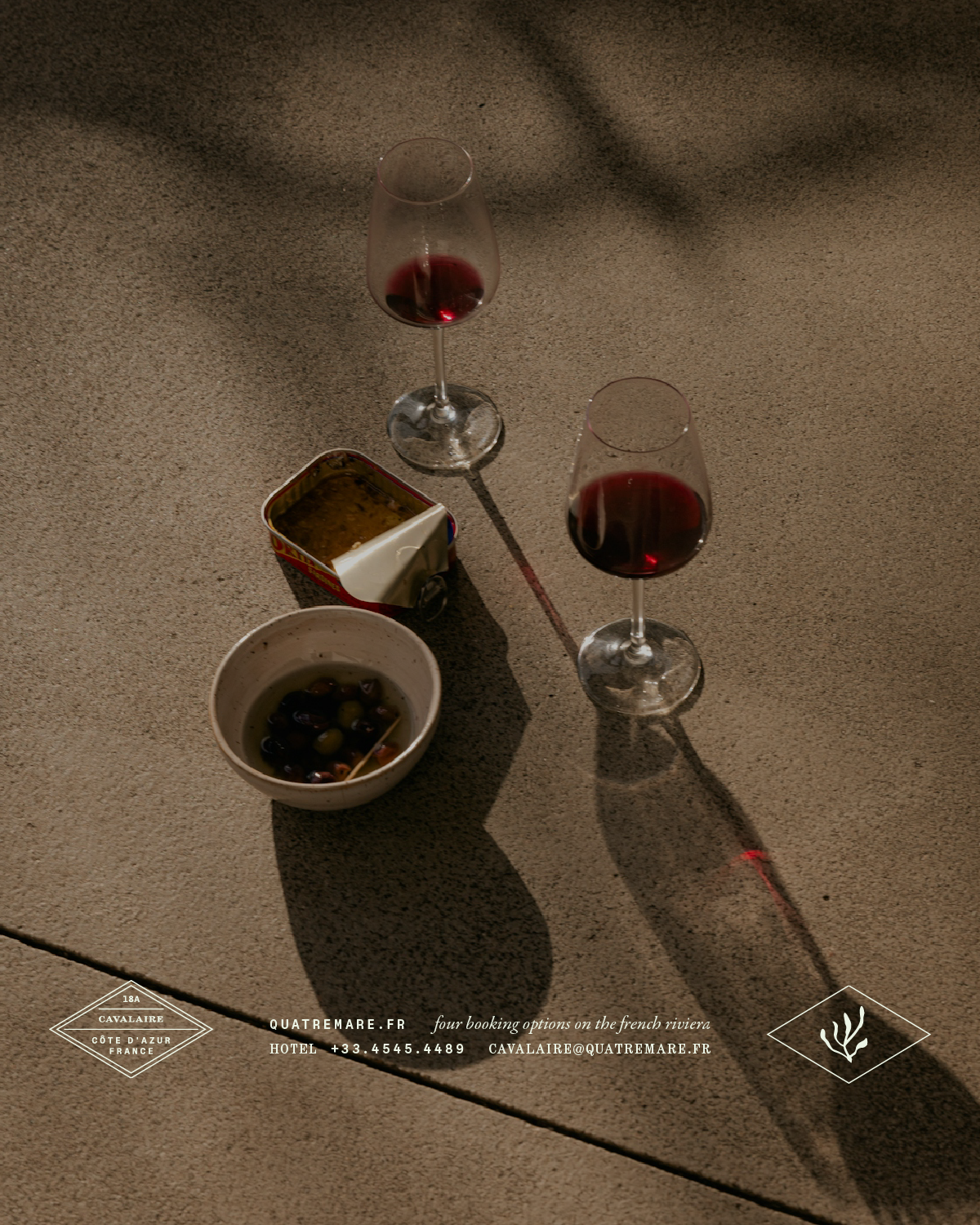
Between 2021 and 2023, we were invited to develop the identity and communication for a set of four hotels located on the French Riviera – Côte d’Azur. The Côte d’Azur is part of the southern coast of France on the Mediterranean Sea, extending to the Italian border. This venture, coordinated by four partners, encompasses various services and staff that are part of the hotel, restaurant, bar, and village located along the coast. One of the innovations in this project is the greater freedom and autonomy offered to its clients, providing various options in hospitality services.
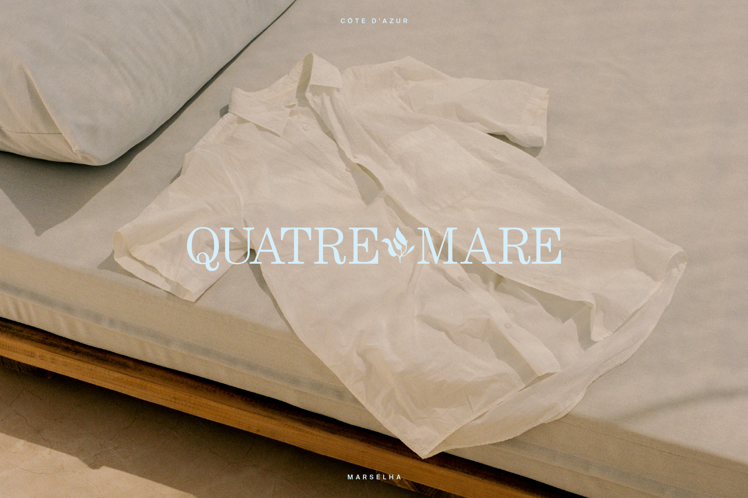
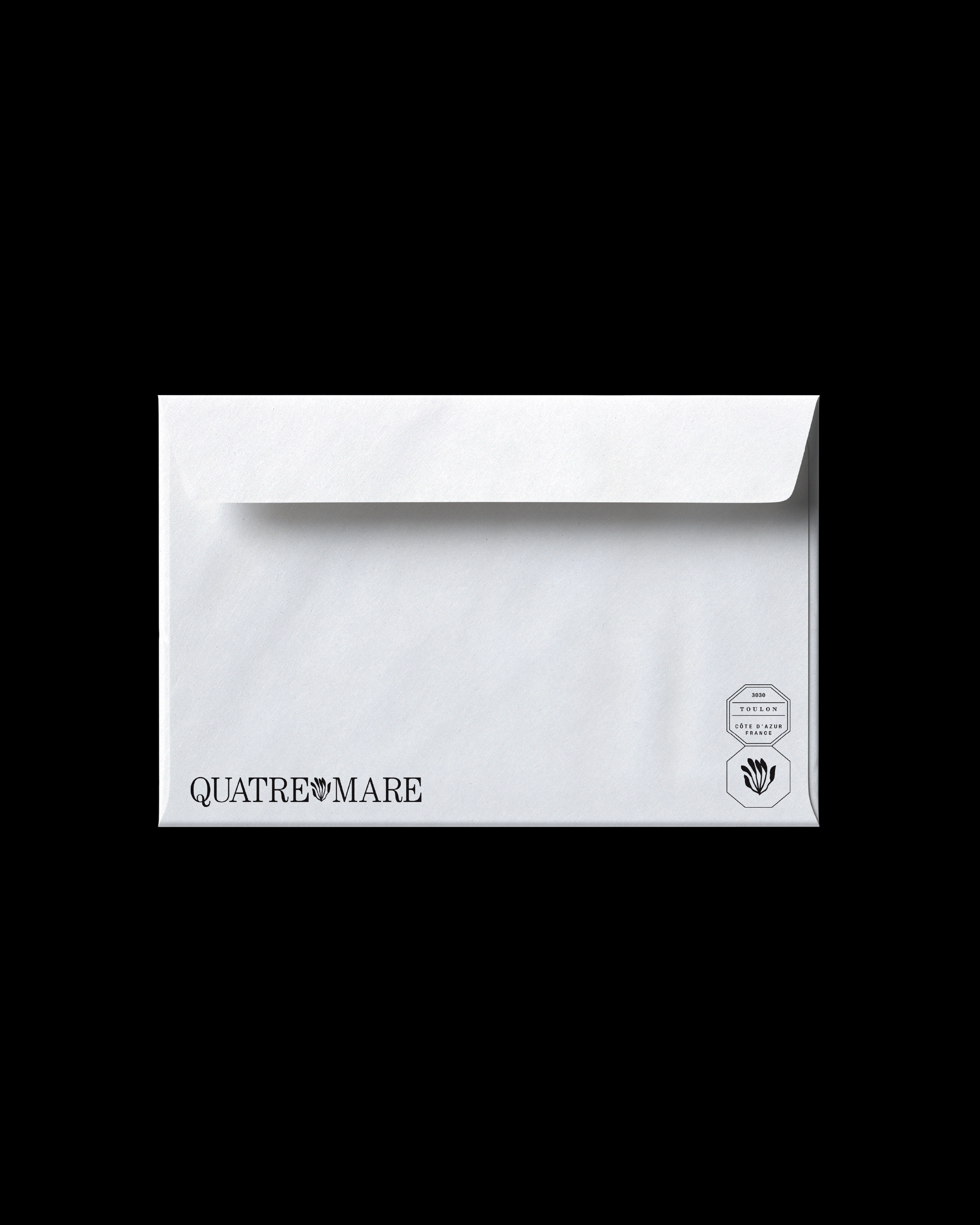
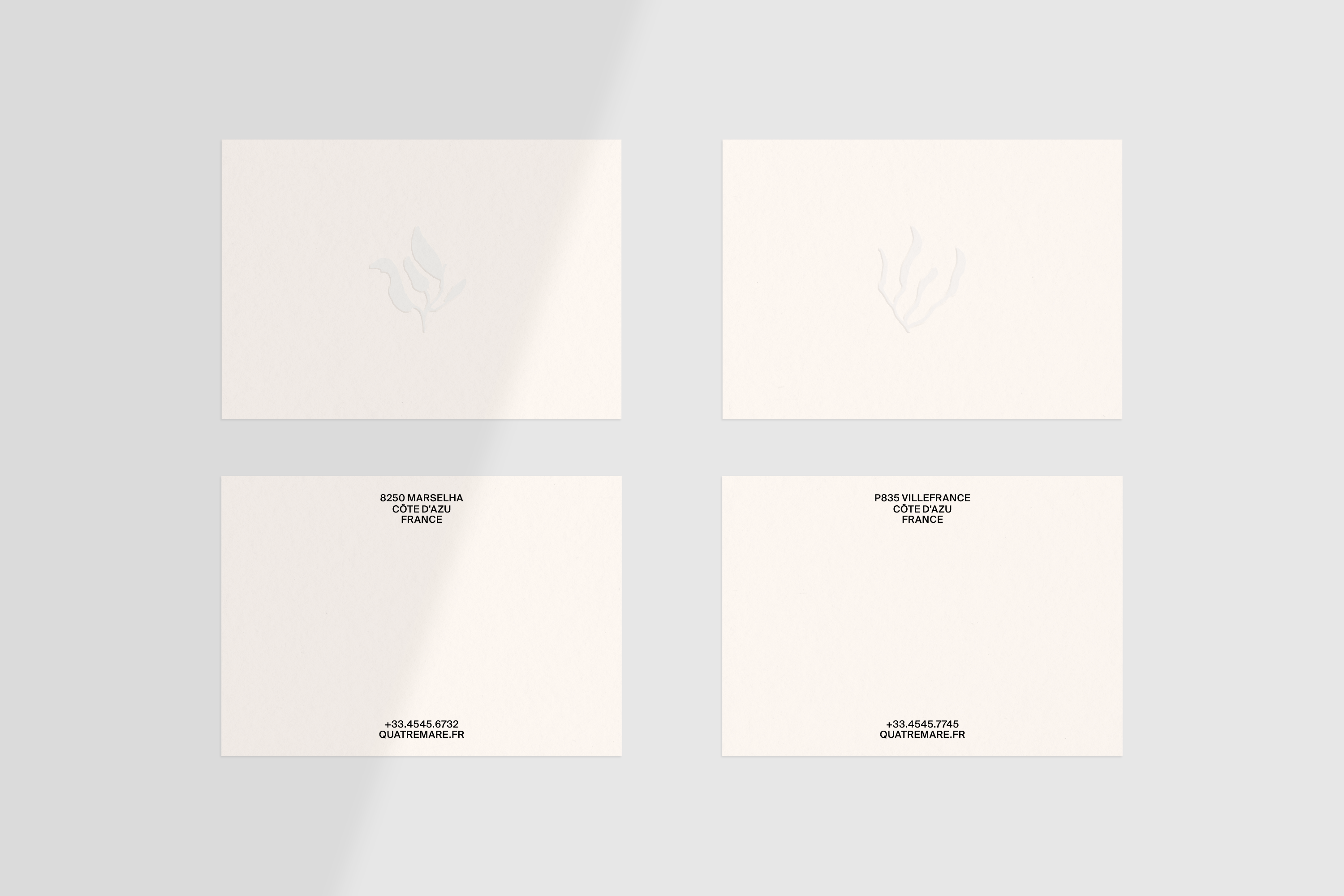
The project involved an extensive journey through the research and positioning phases in its first year. Part of this work focused on designing emblems that represent the seaweed and local vegetation found on the Côte d’Azur, identifying the four ventures through a signature connected to the region. We undertook an exhaustive effort on ITC Century in defining the final logo. This solution was directly influenced by the concept, which guided us in the search for a typographic expression by combining other styles – a common typographic play found in French stamps, connecting the illustrations to their purpose. Combined with the study of colours and photographic style, these elements build the final feel of the brand and its communication.
The project involved an extensive journey through the research and positioning phases in its first year. Part of this work focused on designing emblems that represent the seaweed and local vegetation found on the Côte d’Azur, identifying the four ventures through a signature connected to the region. We undertook an exhaustive effort on ITC Century in defining the final logo. This solution was directly influenced by the concept, which guided us in the search for a typographic expression by combining other styles – a common typographic play found in French stamps, connecting the illustrations to their purpose. Combined with the study of colours and photographic style, these elements build the final feel of the brand and its communication.
︎ Featured
︎︎︎ Visual Journal
︎ Featured
︎︎︎ Visual Journal


Quatre Mare
©2021 - identidade de marca
Entre os anos 2021 e 2023, fomos convidados a desenvolver a identidade e a comunicação para um conjunto de quatro hotéis localizados na riviera francesa - Côte d’Azul. A Costa Azul é parte do litoral sul da França no Mar Mediterrâneo, e se estende até a fronteira com a Itália. O empreendimento, coordenado por quatro sócios, mescla diversos serviços e colaboradores que fazem parte do hotel, restaurante, bar e vila localizados ao longo da costa. Uma das inovações no empreendimento está na maior liberdade e autonomia proporcionada aos seus clientes, oferencendo diversas modalidades nos serviços de hospedagem.
O projeto envolveu um longo percurso nas fases de pesquisa e posicionamento em seu primeiro ano. Parte deste trabalho se deu sobre o desenho dos selos que representam as algas e a vegetação local encontradas na Costa Azul, identificando os quatro empreendimentos por meio de uma assinatura conectada a região. Realizamos um trabalho exaustivo sobre a ITC Century na definição do logo final. Esta solução foi influenciada diretamente pelo propósito e conceito, o qual nos influenciou na busca por uma expressão tipográfica ao combinar outros estilos - um jogo tipográfico comum em selos franceses, conectando as ilustrações ao seu propósito. Somadas ao estudo das cores e estilo fotográfico, estes elementos constroem o sentimento final da marca e sua comunicação.
Quatre Mare
©2021 - identidade de marcaEntre os anos 2021 e 2023, fomos convidados a desenvolver a identidade e a comunicação para um conjunto de quatro hotéis localizados na riviera francesa - Côte d’Azul. A Costa Azul é parte do litoral sul da França no Mar Mediterrâneo, e se estende até a fronteira com a Itália. O empreendimento, coordenado por quatro sócios, mescla diversos serviços e colaboradores que fazem parte do hotel, restaurante, bar e vila localizados ao longo da costa. Uma das inovações no empreendimento está na maior liberdade e autonomia proporcionada aos seus clientes, oferencendo diversas modalidades nos serviços de hospedagem.
O projeto envolveu um longo percurso nas fases de pesquisa e posicionamento em seu primeiro ano. Parte deste trabalho se deu sobre o desenho dos selos que representam as algas e a vegetação local encontradas na Costa Azul, identificando os quatro empreendimentos por meio de uma assinatura conectada a região. Realizamos um trabalho exaustivo sobre a ITC Century na definição do logo final. Esta solução foi influenciada diretamente pelo propósito e conceito, o qual nos influenciou na busca por uma expressão tipográfica ao combinar outros estilos - um jogo tipográfico comum em selos franceses, conectando as ilustrações ao seu propósito. Somadas ao estudo das cores e estilo fotográfico, estes elementos constroem o sentimento final da marca e sua comunicação.